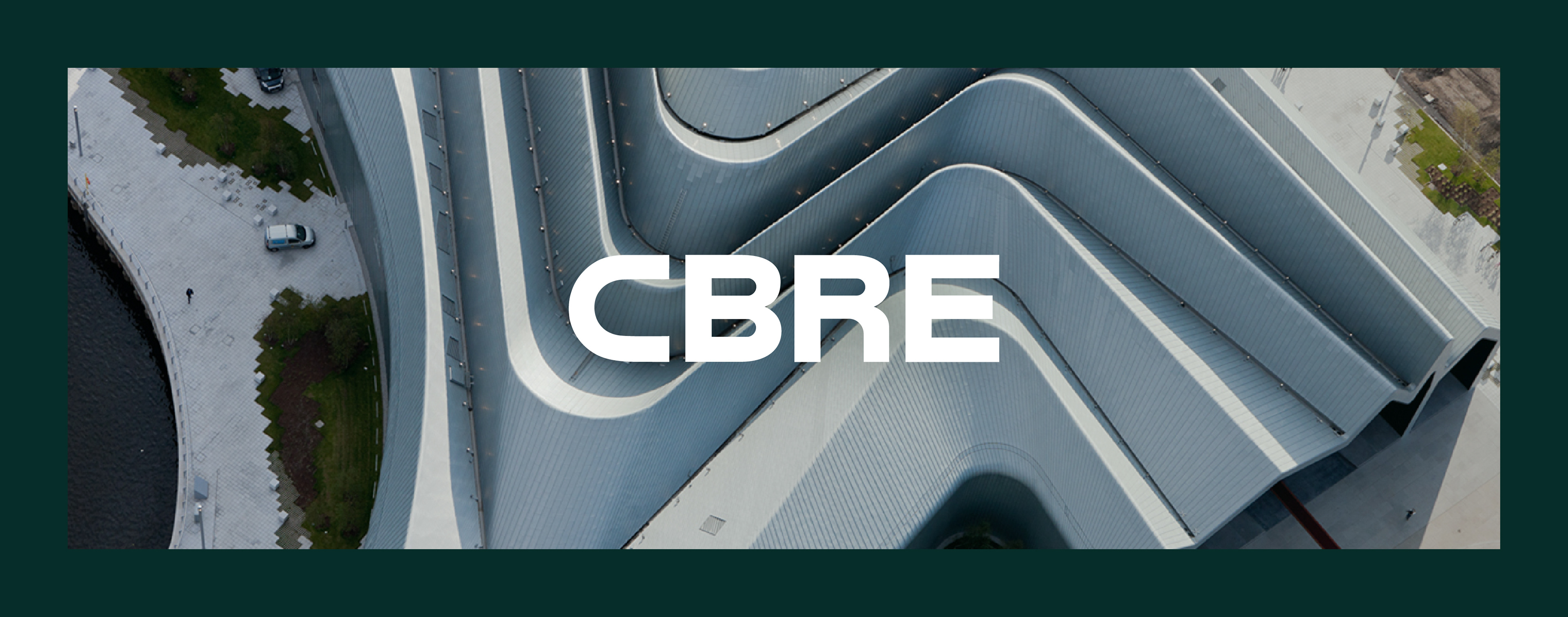
CBRE Corporate Branding
CBRE, a Fortune 500 company, is the world’s largest commercial real estate firm that was getting ready for a huge rebrand when I joined their design team.
Prior to the rebrand, research uncovered how no one truly understood all of CBRE's services. Keeping this in mind, the design team and I conceptualized a design system built around four core elements: muted colors, clean typography, aerial photography, and a visual device called the Line of Sight — a simple line used for emphasis and to guide the viewer's eyes. This design system was intended to provide clarity and accessibility for an otherwise convoluted industry.
This rebrand has created powerful engagement that has driven considerable awareness for CBRE, positioning them at the forefront of the real estate industry.


New Infrastructure for the World's Largest Real Estate Firm
As CBRE grew globally, their website was re-structured for clarity, emphasizing their services with clear and direct messaging to help remedy visitor confusion.


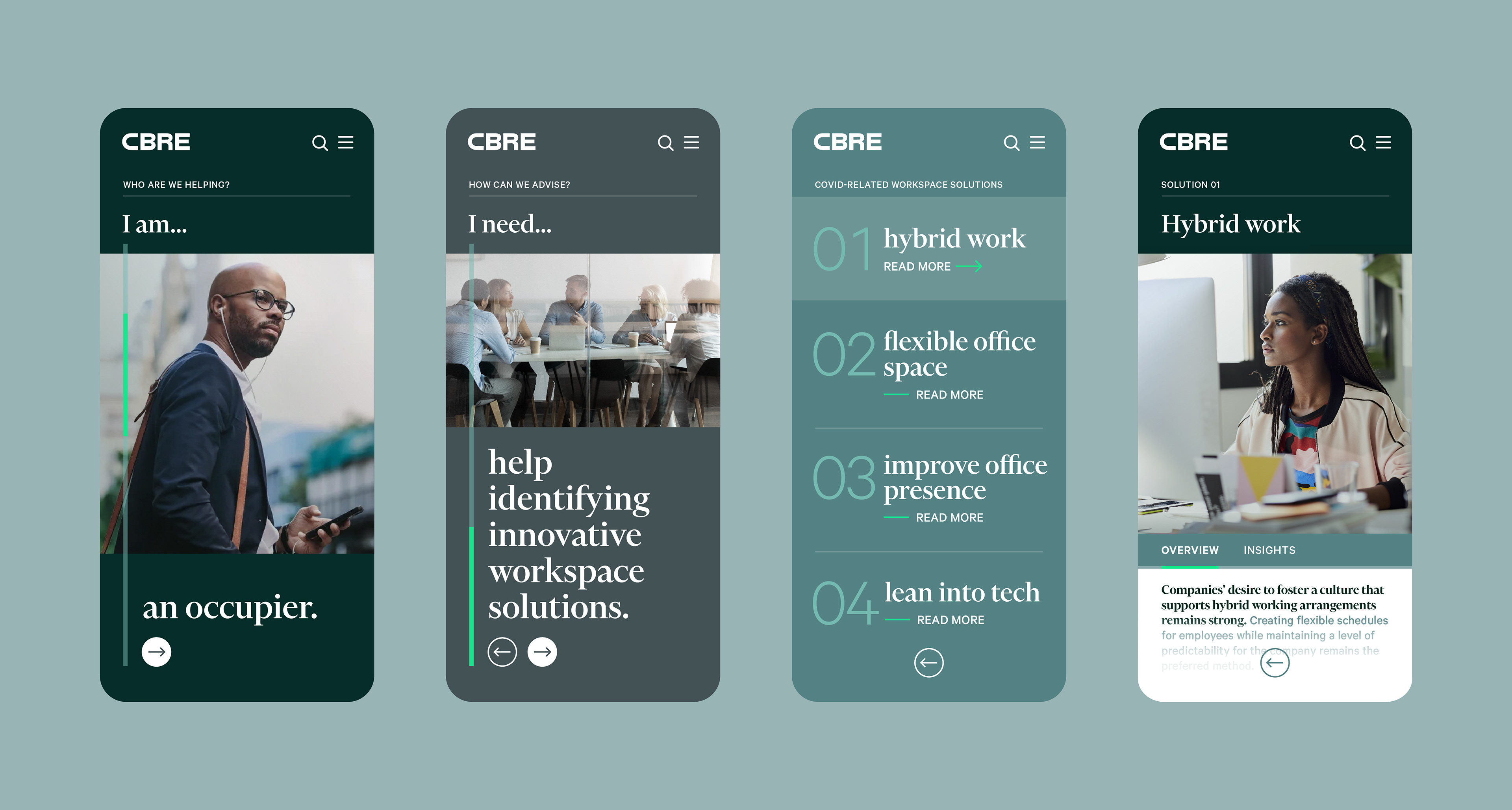
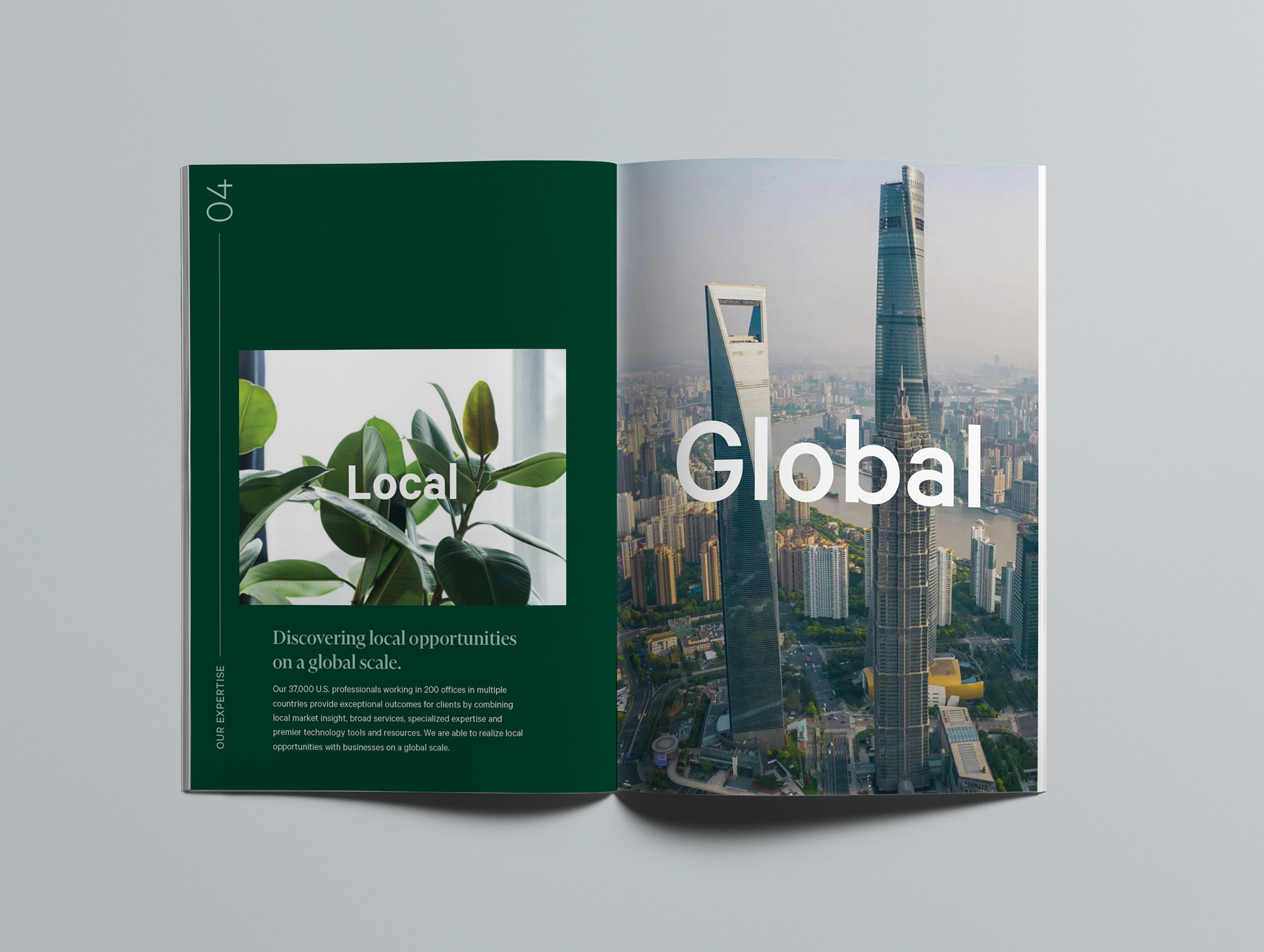
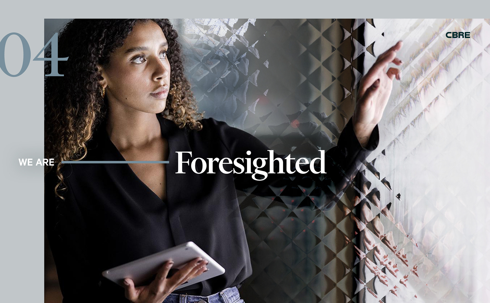
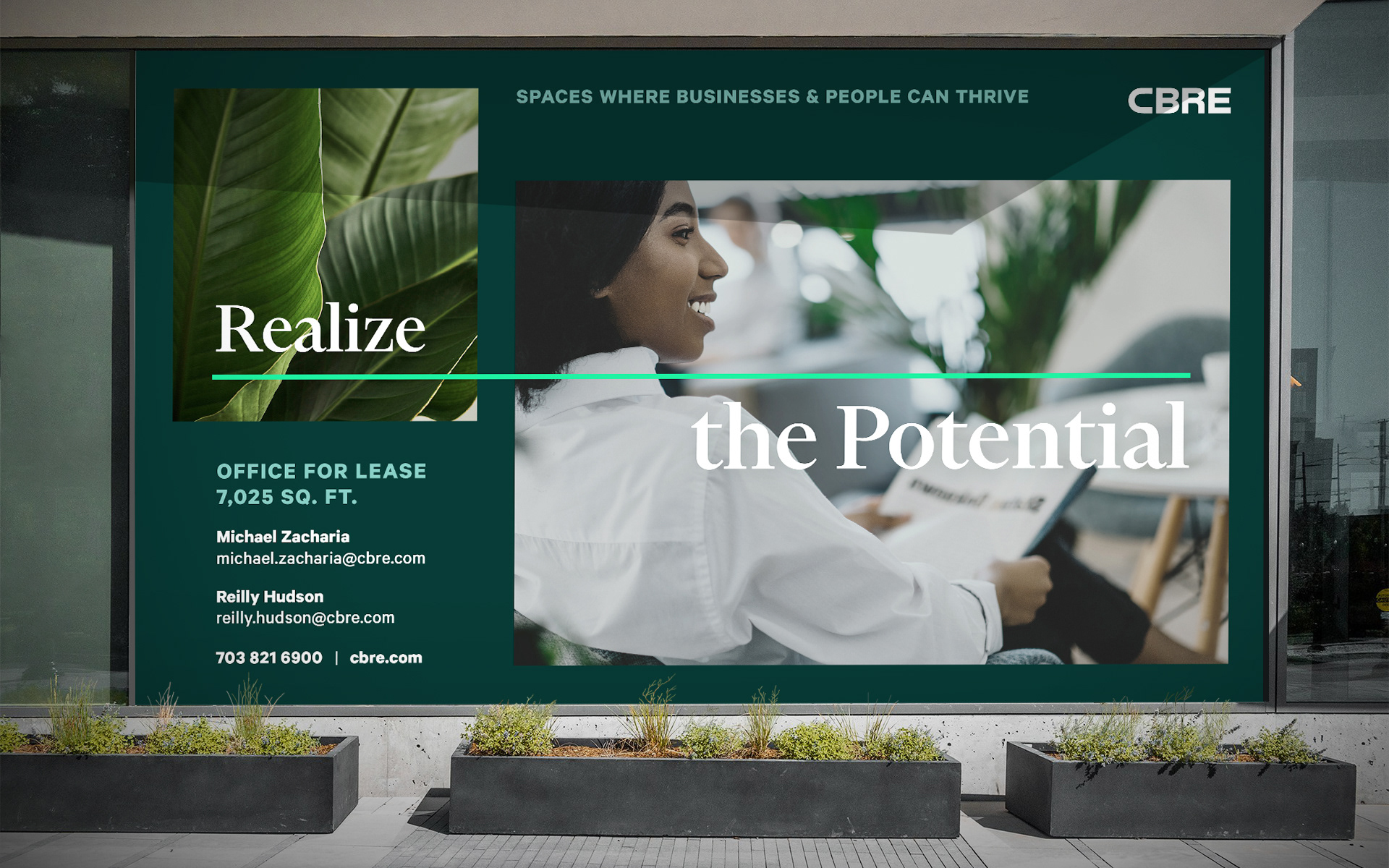
Draw the line
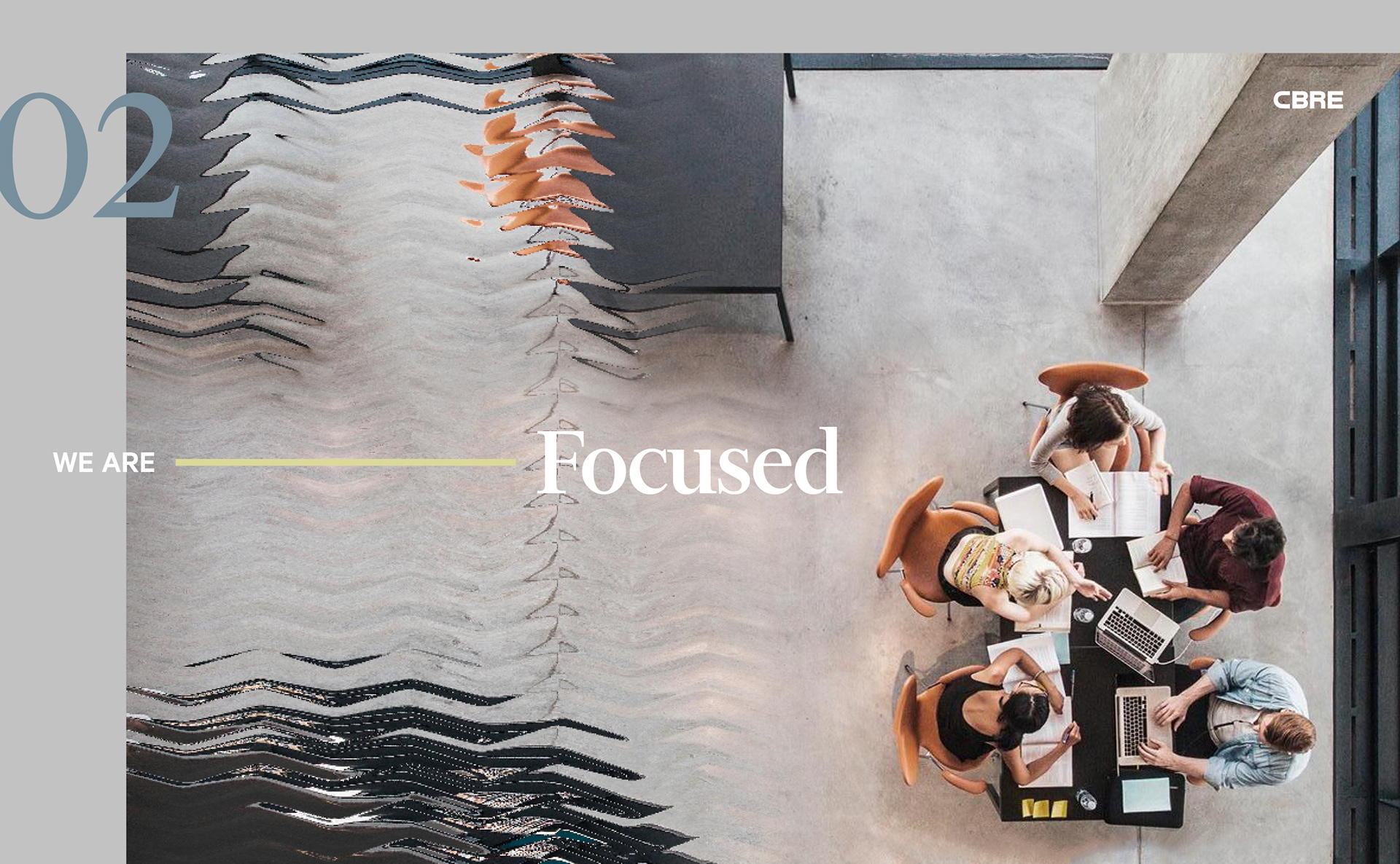
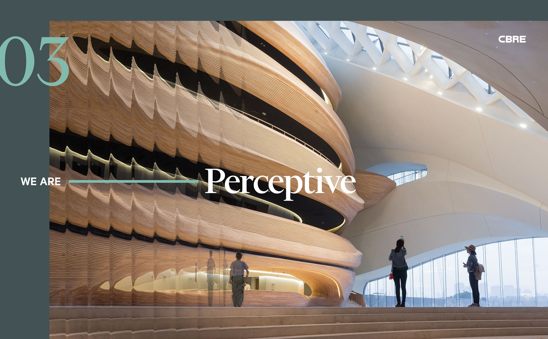
The Line of Sight, a strong rectangular element derived from the CBRE logo, connects text, highlights imagery, and guides the viewer's eyes.
Horizontally, it represents CBRE's breadth and big picture thinking. Vertically, it signifies their depth of knowledge, focus, and precision.


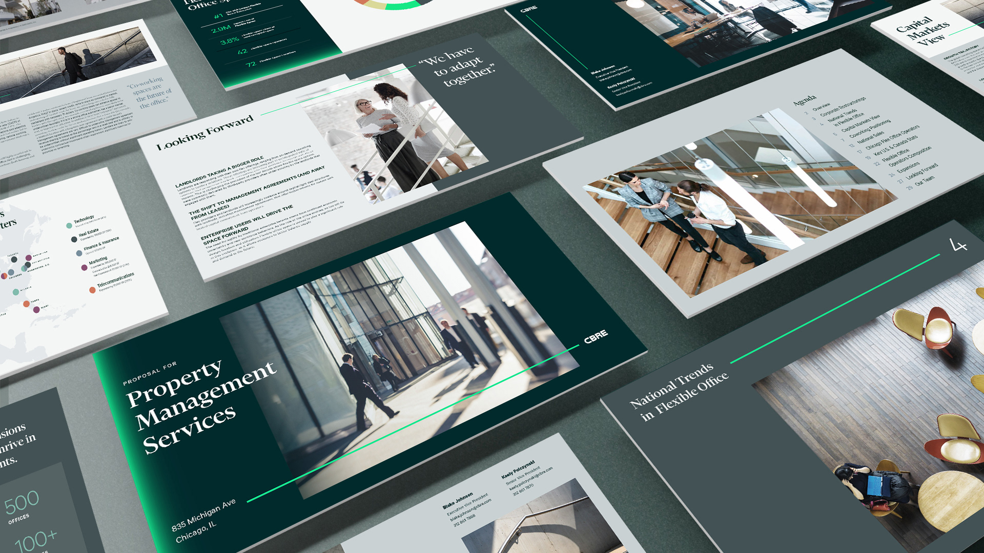

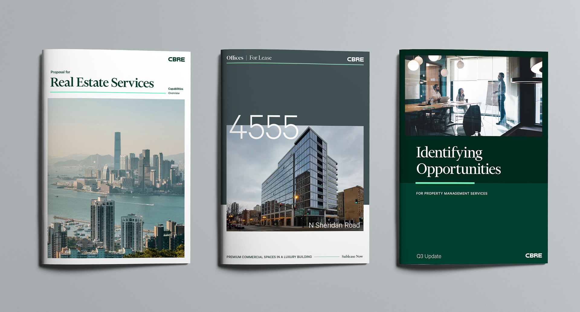
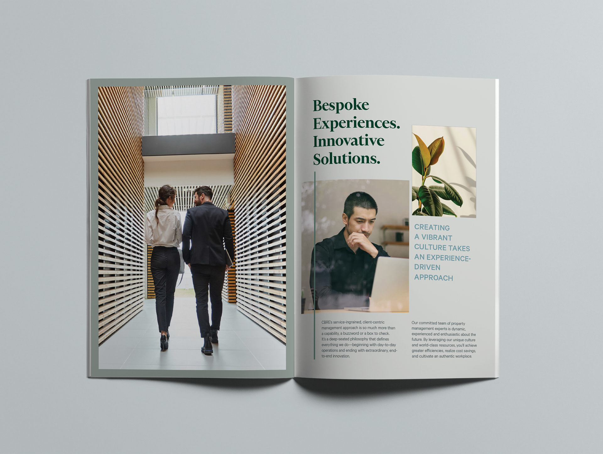
Seeing the world differently
CBRE carries diverse perspectives that contribute to their extensive knowledge and insights into real estate, shown in these custom presentation decks, proposal booklets, and infographics.

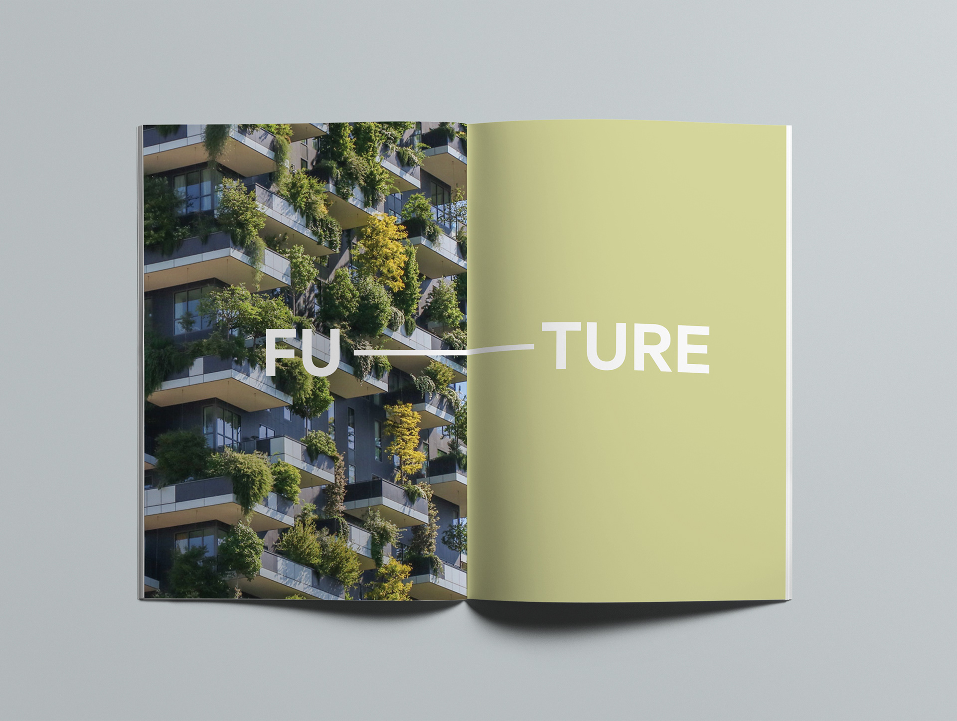
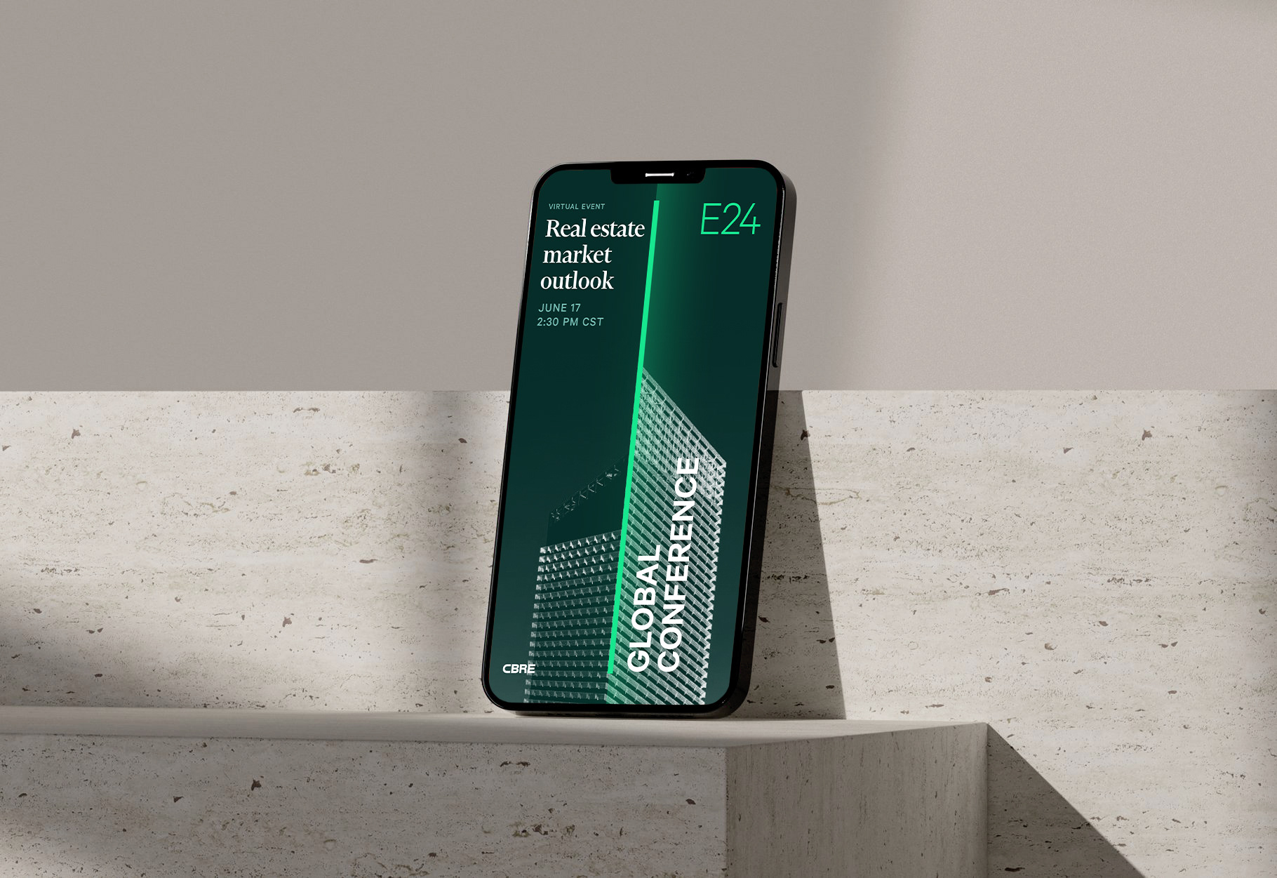
Looking towards the future
Social media graphics promote CBRE's conferences and podcast called The Weekly Take, where leaders share their real estate insights and its impact on the world.


To protect sensitive information, data, values, and other details represented in these images and diagrams may have been altered or omitted.